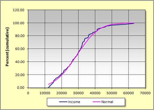
Cumulative Frequency
Sample Results as an Excel Chart:
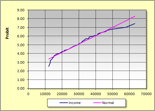
By choosing the Probit option, you get a chart in which any normal distribution appears as a straight line:
![]()
the Statistics Add-In for Microsoft® Excel
By choosing the Probit option, you get a chart in which any normal distribution appears as a straight line: